 Perot Museum of Texas
Morphosis’s overall conception of the Perot Museum as a large cube floating over a landscaped plinth responds to the Dallas myth as a city arising from the plains of Texas purely out of human will as well as embodies the logical rigor of science in providing a stable framework for making sense of the complexities of the world.Within, the orthogonality of the cube provides a datum against which architectural relationships enrich visitors’ museum-going experience in the sequencing of program and circulation enhanced by material choices and spatial drama.
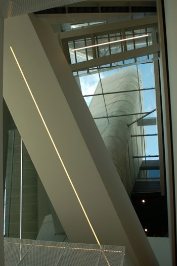
At the main entry level, before finally entering the ticketed area of the museum, visitors go through a series of spatial conditions beginning at the glass doors leading from the entry plaza. Upon entering the glass doors, visitors come upon a vestibule that is essentially an air-conditioned version of the exterior entry plaza, girded above by the same concrete panels that cover the exterior walls of the landscaped plinth and the main cubic volume. The glass-ceilinged vestibule, straddling both the interior and exterior of the main cubic volume, serves as a node that connects the museum proper, housed in the cube, with the ancillary public spaces of the museum store and the cafeteria, housed underneath the landscaped plinth swirling around the main cubic volume. Within the perimeter of the main cube, the vestibule melds with the main circulation atrium that runs the full height of the cube, a formal rupture in the main cubic massing of the museum. The atrium is visually open to the sky above through a glass ceiling and views of downtown skyscrapers to the southeast through the glazing that interrupts the otherwise opaque exterior skin of the cube. Underneath the crisscrossing stairs and bridges that appear to mend the rupture above, visitors cross a chasm into a tunnel through the orthogonal service core containing the elevators. From the compression of the tunnel, visitors emerge into the expansive space of the queueing hall, where the visitors turn 180 degrees to find the ticketing counters standing against the solidity of the service core. The queueing hall continues the theme of ambiguity between exterior and interior in the way its undulating ceiling flows past its exterior glazing in such as a way that denies its enclosure, leaving its spatial definition to the footprint of the main cubic volume floating above, yet to be penetrated by the visitor.
Past the ticket checkpoint of the queueing hall, visitors are invited to finally depart the entry level through the first of three escalators that lead to the exhibition halls. The first escalator is oriented diagonally in plan from the axis of the main cube, going through a funnel that punctures the undulating ceiling of the queueing hall. At the first landing, visitors come upon a glass volume protruding diagonally out of the concrete cube, forcing their downward gaze onto the landscaping below. The second escalator, which runs along the interior of the perimeter skin of the cube, appears to take off from this view of the earth below and into the unknown. The path of travel shifts at the top landing of the second escalator from the interior of the perimeter skin to a glass volume that carries the third and final escalator along the exterior of the cube, expressing diagonal movement on the exterior elevation. In contrast to the previous escalator, the final segment allows unhindered views of downtown skyscrapers and terminates in a slanted glass wall that points to the open sky. At the top of the escalators, visitors can marvel at the stairs and bridges that crisscross the atrium below before proceeding to the exhibition halls.
Having been subjected to the architecturally glorified ritual of entering into the museum experience, visitors direct their attention to the displays in the exhibit halls, housed in the bulk of the cubic volume. The open and straightforward spaces defined only by the walls of the perimeter and the service core allows the exhibits without much competition for attention, not that the engaging exuberance of the exhibits need much help captivating visitors. The vertical stacking and the arrangement of the exhibition zones on each level reflect both chronological and thematic relationships. The top level where the escalators deposit visitors contains exhibits explaining the origins of the universe and prehistoric life, whereas the lowest level contains exhibits presenting today’s ecological issues, human life, and technological innovations. The clockwise rotation of the sequence of spaces through the entry level and the escalators reverses at the exhibition spaces, which seem to direct visitors follow a generally counterclockwise rotation around the service core. For instance upon arriving at the top of the escalators, visitors first come upon the Expanding Universe Hall explaining the origins of the universe before the appearance of life, followed on the same level by the T. Boone Pickens Life Then and Now Hall, which features prehistoric life, before coming upon stairs that lead to the Rose Hall of Birds, a mezzanine level overlooking the giant Alamosaurus skeleton that peeks above its guardrails, making a connection between the birds of today and the dinosaurs of yesterday. Visitors return to the atrium to circulate down to the next level, each time allowing the bright light of the sky above and the expansive views of Downtown Dallas to wash over them as a unifying motif in the museum-going experience, reminiscent of the catchy “Promenade” theme stringing together Modest Mussorgsky’s meditations on the “Pictures at an Exhibition.”
It is true that most of the visitors of the Perot Museum, an overwhelming majority of whom are young school children, might not have Mussorgsky playing in their mind’s ear as they ponder Le Corbusier while promenading about the architecture. However, the architecturally sublime way Morphosis has arranged, housed, and embodied the museum-going experience surely does not take away from the success of the museum in fulfilling its mission to inspire “the visionaries of tomorrow” in the crowds of school children that regularly throng its halls. Beyond satisfactorily meeting practical programmatic requirements, what the Morphosis design for the Perot Museum surely offers those who will look more closely is the possibility of pondering nature and science in a more profoundly satisfying way through the medium of great architecture.
 New Works by Aron Demetz @ Gazelli Art House
images shot by JEJ for FACADES

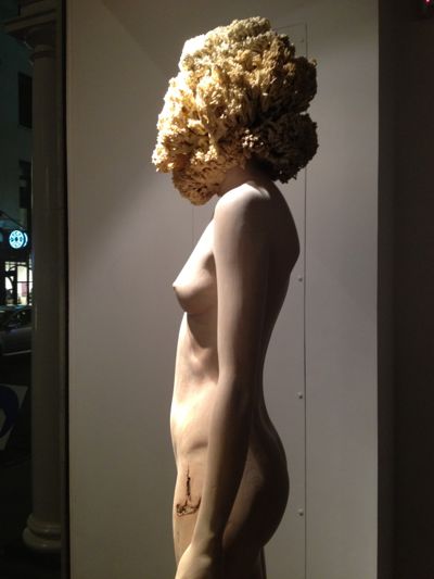
Work 1 -Sensa Titolo 2013. Maplewood and silicon, 60x217cm
Work 2 -Front, 2012. Limewood 50x62x40cm
Work 3 -Proposta KR 150, 2013. Limewood 75x235x60cm
Work 4 -Pholiota Denuntians, 2011. Maplewood and silicon 50x200x50cm
 Handmade & Digital Crafting At Salone del Mobile 2013
Filmed by JEJ for FACADES
In order to turn a brilliant idea into a design object using leading-edge technology, one must first appreciate raw material and its potential and do manual woodworking techniques first then eventually be machine made.
This is what the organisers of 'I Wood Like' hopes to convey to young designers....
FederlegnoArredo, SCM Group and Culturalegno created this project @ Saloni Del Mobile 2013 in Milan Italy.
 Current Innovation in Light
Filmed by JEJ for FACADES
Display installation on lighting by French Designers at the Salone Satellite 2013 in Milan.
 Vertical Hydroponic Garden Design
Filmed by JEJ for FACADES
Another new option in the future of gardening where space is limited and people end up living in high buildings...
 Salone Satellite Design Awards 2013
Filmed by JEJ for FACADES
The SaloneSatellite was the first event to focus on young design talent and immediately became the quintessential meeting ground for manufacturers, talent scouts and the most promising young designers. Its creation in 1998 by Cosmit was an act of faith in the creative potential of young people. Many of the prototypes presented in previous editions have gone into production, and many of the designers who debuted at the Satellite have since become important names. -Cosmit


