 HANA CHA SS'13
filmed by JEJ for FACADES
This young designer has a grasp and understanding of synergy: the relationship between a woman and the clothes that woman wears. She doesn't seem to dress clients; she seems to dress friends; people she knows. With fringes generously strewn all over, panels of trousers, superimposed on dresses, and the occasional vine swaying unapologetically from otherwise 'acceptable' ensembles, Hana Cha renders her wearers dressed for certain and real occasions without making them look quite the victim. Perhaps, because the clothes don't eclipse its wearers. Or maybe, Hana's happening.
There were two pieces that punctuated this lady's philosophy for me: the all-white pantsuit ensemble and the simple, black jumpsuit. This talented designer has either a keen understanding of what women want, or perhaps, she's mature beyond her years. I suspect, she possesses both attributes.
 CHARLOTTE SIMPSON SS'13
filmed by JEJ for FACADES
Minimalism is best served with a sure hand. The absence of flourishes and decoration forces the beholder to concentrate on line, proportion and workmanship. I saw very little of the sort in this collection.
The opening number, a shift in pleasing eggshell white, which quietly gradated to a shimmer of yellow toward the hem, was a welcome feast to the eye. Alas, when the following pieces of trouser ensembles followed, the brevity one expects from all things minimal was transmogrified by pyjama-cut trousers topped by sleeved and sleeveless jackets that may have brought the word, 'frump' back to the vocabulary. I adore garments that flow away from the body. The sort that tricks the eye into imagining an oscillating figure within the garment. But the absence of well cut sleeves and graceful armholes is akin to a statement devoid of punctuation. The jumpsuit that was part of this bifurcated portion of the collection, with its V-neckline, flowed smoothly down the ramp. Still, the sleeves needed more attention. They were matronly.
My favourites: the shimmery, bronze, three-quarter sleeved jacket worn over a pale terra cotta pant; the long shimmery dress in yellow and white; and the finale dress, resplendent in gold shimmery embroidery. The models could barely walk in them. But I trust, that would be noted for the next collection. Charlotte Simpson shows promise.
 EKATERINA KUKHAREVA SS'13
filmed by JEJ for FACADES
The productions at the Vauxhall Fashion Scout events held at the Freemasons' Hall Building is the venue and platform, on which London's new design talent are given a chance to strut their stuff: the main reason we attend; also because it's close to our hearts.
The collection of Ekaterina Kukhareva shown within the building may have proved a tad too meritorious for its venue simply because it lacked that amateurish air. As a technician, I couldn't help but marvel at the collection's mastery of its sleeves' settings (I counted 7 out of about 20 pieces; most collections forego this one component that truly serves as a hallmark to a dressmaker's mettle), the wearability and ease with which the models sauntered down the catwalk, and the combination of colours that spelled spring in today's locution. With nothing to prove, Kukhareva spoke volumes. And speaking in hush tones, I heard loud and clear. We only hope to be invited to her next collections.
 Sade English: Brave New Name
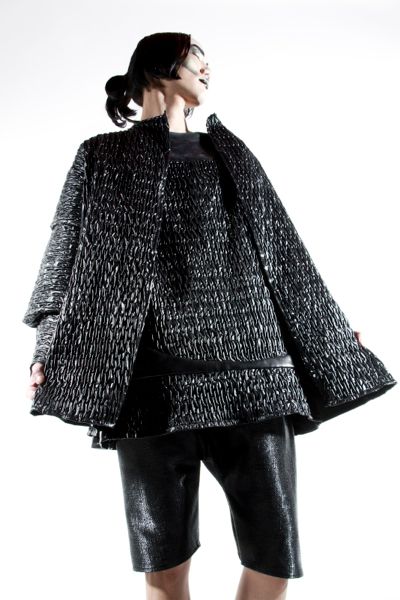
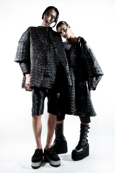
"Designing garments that are not built to suit society but to embrace individuality. This  A/W13 collection specifically was inspired by my belief of being anti-clone and wanting both women and men to wear it, inspired by samurai and experimenting with unique texture and shape."
- Sade English
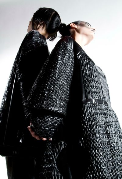
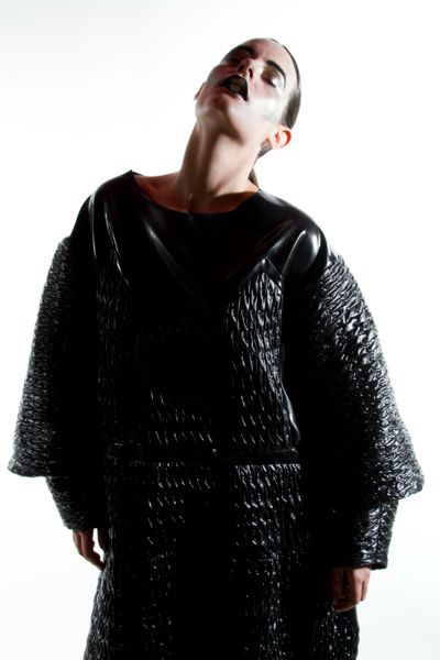
The limited edition pieces are inspired by and consist of elements taken out from the traditional Islamic architecture and Samurai armour. The shapes, outlined in each garment, are similar to the shapes that could be seen in mosques.
Architectural futuristic outlook on design and garment constructivism, in a combination with historic art and dark gothic elements within her pieces, end up creating her signature style.Â
A mixture of past and future elements. Japanese armour alongside the surrealistic, reminiscing the trompe-loeil technique elements gives the pieces the unexpected alien and futuristic look.Â
The fabrics used are nylon, polyester and pvc, which complements the qualities in each fabric. The detailed textured polyester creates a unique and at the same time decorative technique element to the pieces. Her designs are exuded with precision and have a perfectionism polish.
-Press Release by University of the Arts London. Images shot by Alex Bishon RowlandÂ
Sade English has graduated from London College of Fashion, studying Fashion Design and Pattern Cutting. Leaving LCF after finishing her Foundations Degree, as she needed more freedom in expressing herself as a designer, English created her own label just at the age of 21. Over the years she has developed her unique ability to create visionary garment structures that join up with the human body and form completely new shapes. One of the main aspects of Sade English Design is to stand out of the ordinary by setting a new approach and revolutionising the traditionally targeted fashion fields. The clothes will be supporting the counter-stereotype. Therefore they will not fall into categories like womenswear or menswear, not even unisex, as their major purpose is to assemble the inner and outer self of the customers in one. Every piece is designed and hand made by Sade English. She is well known for her strong individual style and feminist viewpoints. By experimenting with unidentified shapes and different techniques of pattern cutting, she reached to the conclusion that clothes could be so much more than what they are presented within the majority. The garments are a mixture of historical and futuristic elements, set up in not only one, but in different directions. The pieces do not follow the ideas of beautiful and pretty but reinvent the ugly instead, turning it into a sensational piece of art and fashion. Unusual shapes, nontraditional fabrics and monochromatic, over sized pieces is what you could expect from Sade English. Putting those elements in one, the result is remarkable, representing the futuristic, anti-clone vision of the designer.  -PR of Sade EnglishÂ
 STEFFIE CHRISTIAENS SS'13
filmed by JEJ for FACADES
Barefoot. They came out barefoot. To me this means, the clothes will speak for themselves and although they all said something, others pieces articulated better.
The palettes were mostly pale: white; grey; white and grey; and the most delicate, almost indistinct pastels. The pant suit was a definite staple just as the skirt and tops were. Comfortable, straight cut dresses adorned the runway. And while some of them were a joy to behold, a few were cumbersome with sleeves that weren't cut to a good standard. One straight-cut, long-sleeved dress in black, I couldn't decipher from a dress to a coat. Perhaps, it was both.
A long, floaty, silken number was a show stopper which worked well, especially because it was truly a metamorphosis of a dress and a gown. Mind you, even without the help of heels, that piece worked, indeed.
There were a few dresses that I felt were over-designed since my eye wandered all over the place to understand them. In their case, I reckon, killer pairs of good heels could have averted this misfortune. There still is a lot to be said about what fabulous pumps/heels can add to a look even if just to affix that certain grace and jaunt needed to don them. My favourite outfit: The combo of a black top over a grey skirt which was beautiful, balanced, cut well and, I think, embodied the designer's true philosophy.
 Fashion Presentation Meets Art Installation: Y. Project by Yohan Serfaty
 Video of The Y. Project by Yohan Serfaty @ Galerie Nikki Diana Marquardt, 10 rue de turenne, Paris 4e - June 27, 2012 shot by JEJ
More or less like a returning 'newish' trend these days in Paris as done before in a variety of ways in the past like in the 60s, a fusion on Fashion and Art.
Moroccan born French designer Serfaty who originally studied Political Science got fashion training from various couture houses in Paris.
He presented his SS13 collection of clothes and accessories in an art installation come fashion show.
Interesting pieces were put together in a conceptual theme that attracted quite a few curious 'camera trigger happy' guests non stop...
Sleeping masked models rose from their beds and paraded light fabric clothing pieces in whites, light & dark hues of grey.
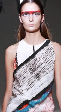
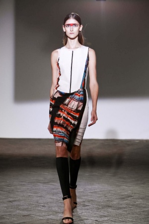
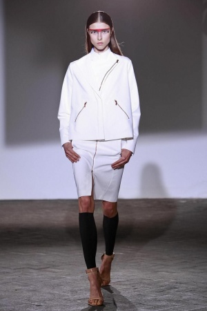
 Cedric Charlier SS13
After his time at Cacharel as Creative Director ended last year, Cedric Charlier Today debuted his first Spring/Summer collection for 2013. His second collection since going solo. Working under his own name gives him total creative freedom. His aesthetic is a contrast from the delicate floral prints of Cacharel. Inspired by YSL his aim is to empower women with his designs. Charier’s new collection has a strong direction of sport lux tailoring, in bright whites featuring exposed zips. Pulled together with draping silhouettes, showing an ethnic influence and multi-coloured prints with strong accents of shocking red creates a powerful look. Relaxed brush strokes loosely resembling a check print form the energetic pattern. Models had bright red paint across their brow with hair slick and off the face. An understated sandal was the chosen shoe, worn with leg warmers. Another impressive collection.
